Product photography is something that I love doing. I reckon that over the past couple of years of doing it at Pimoroni I’ve improved, and I’ve definitely developed more technique. I do a mix of photography at Pimoroni - some images on plain white backgrounds for our shop pages, and some fancier setups to really showcase the products in tutorials and blog posts.
Josh on our Discord channel was asking recently if I could share any tips on taking nice product photographs, so I thought it might be useful, and even interesting, to write it all down in a blog post. A lot of it is standard photography stuff that’s not at all unique to my process, but you might still get some useful nuggets of information out.
My top tips are in bold throughout this post.
The image/s that I’ll be talking are ones that I took of the Pimoroni Inky pHAT, a three-colour e-paper display. It’s similar technology to the displays that you find in Kindles and other e-readers, except that these displays have an extra red-coloured pigment, as well as the black and white pigments. The displays have a matrix of electrodes that corresponds to the pixels on the display and electrical charges are used to pull the particles of pigment up and down inside the display to create the image.
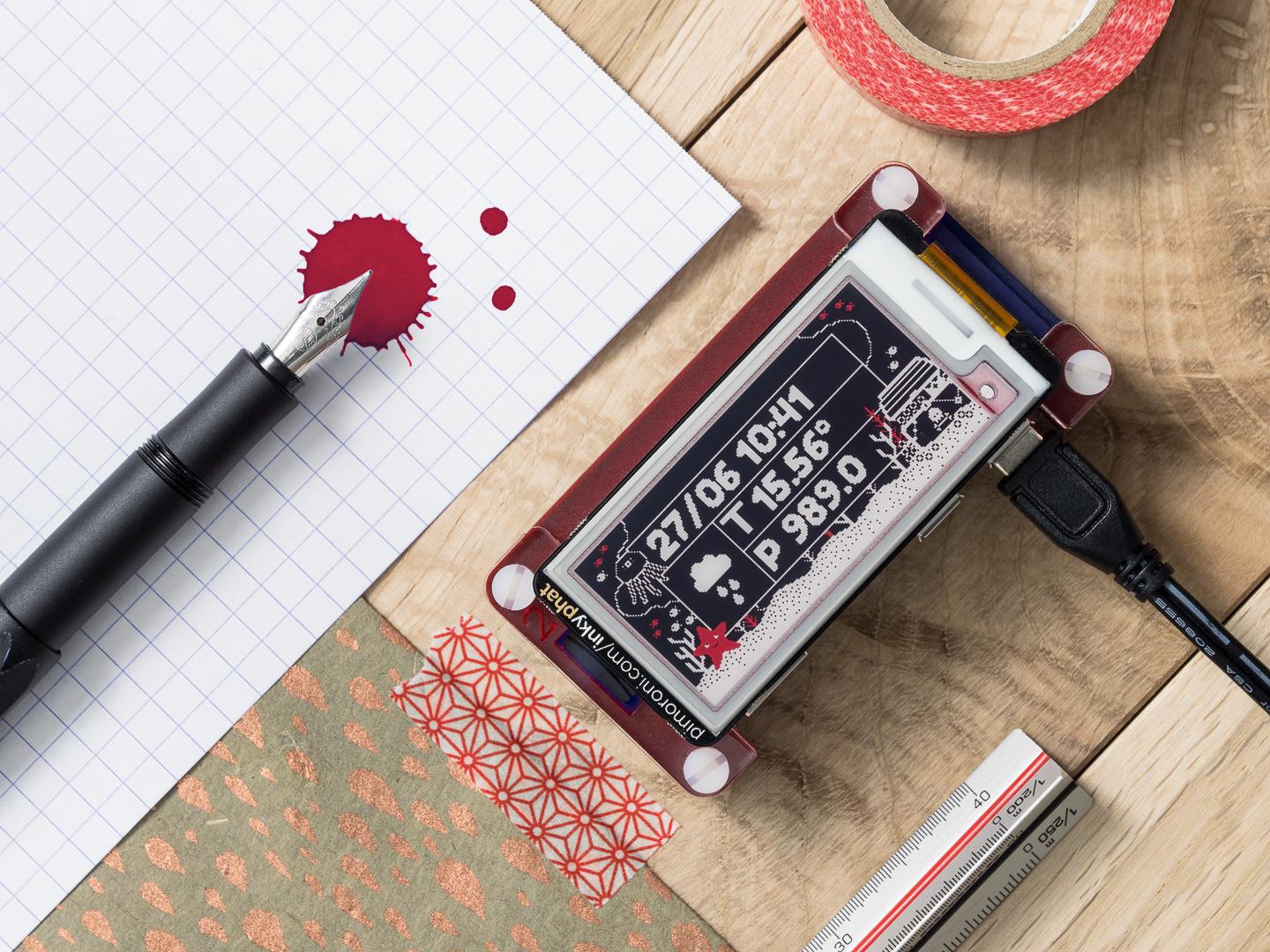
Here’s the final image.
Briefly, the whole process is as follows:
- planning out the shot
- composing
- taking the shot
- basic post-processing in Lightroom
- re-touching and more post-processing in Photoshop
- exporting the final image in Lightroom
Every product photo is different, when it comes to this process. Some products sit better on their own, while others look better in context with other objects. More often than not, I’ll tend to take more abstract shots, using other objects and props to complement the main product, but not in a setup that you’d have on your desk necessarily. Other times, you’ll want specifically to build a shot that’s completely true to life.
I’d encourage you to be inspired by photos that other people take; build up a collection of images that you like, either on Pinterest boards, or a physical scrapbook or mood board with photos from magazines. It’s important to develop your own style and technique though.
Planning out the shot
In this case, I had a basic idea of the way that I was going to structure the image, playing on the “Inky” in the product name, and on the red, black, and white colour scheme.
I love fountain pens, and have a bit of a collection of pens and ink, so I knew that I was going to use both of them in the image. Other items of stationery seemed to make sense too, and I’d picked up a few pieces in Berlin last summer from the (insanely great) Modular stationery shop (seriously, if you like stationery and are ever in Berlin then pay a visit).
I thought that a wooden surface would fit well with the feel of the image and ended up using a lovely oak board to sit everything on. Here’s one of my product photography top tips!! Sample pieces of laminate and wood flooring and tiles from a DIY store like B&Q or Homebase are cheap and make really interesting backgrounds on which to shoot products. The background in these images is three sample pieces of solid oak flooring slotted together and then screwed down to a couple of short battens on the back.
Composing
Composition in product shots is really important. Again, it can vary depending on a case-by-case basis, but I tend to follow all of these rules:
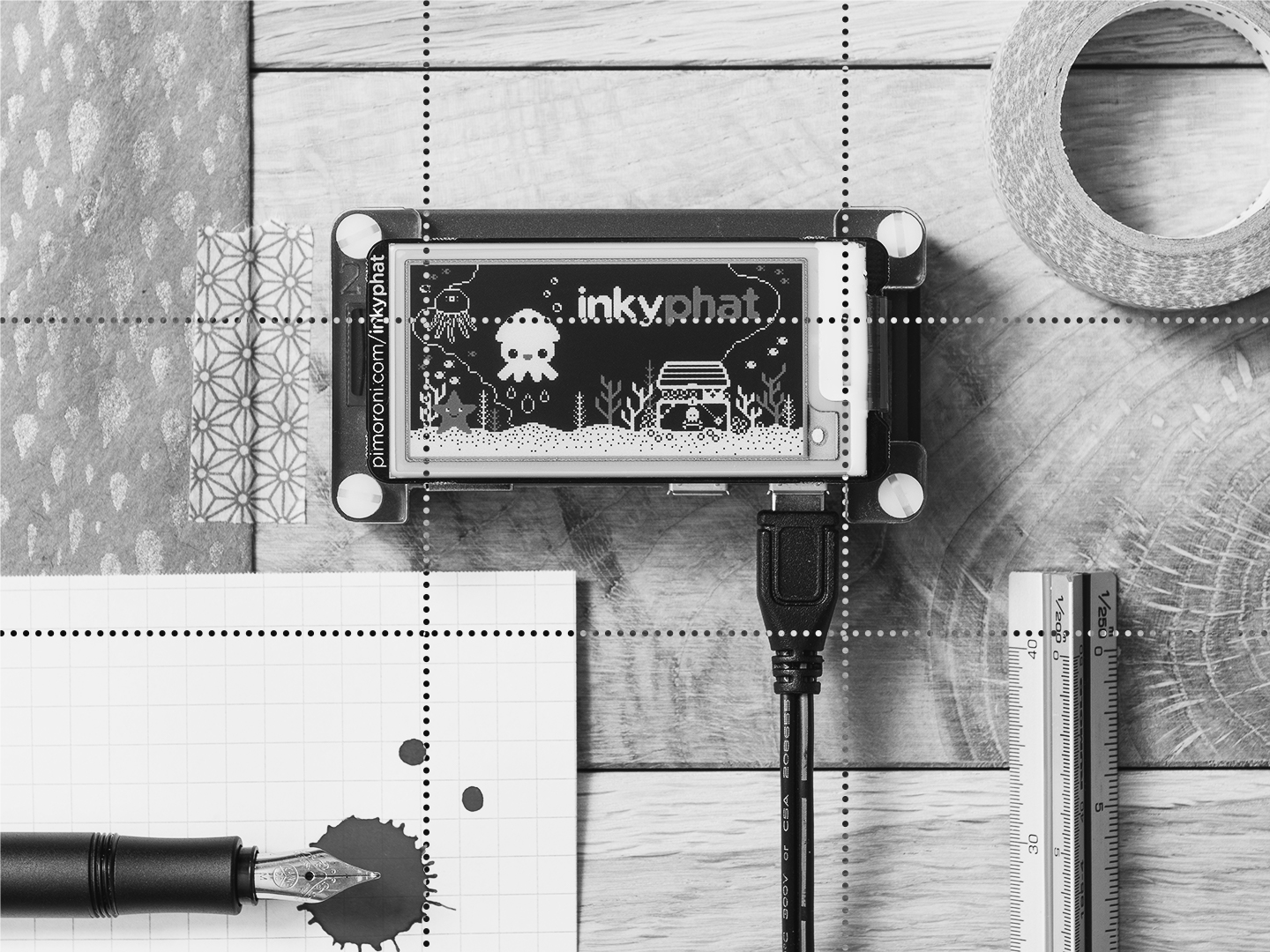
- obey the rule of thirds
- don’t draw too much attention away from the main product/s
- have good lighting
- have the product near the centre of the image
- have the key part, if not all, of the product in sharp focus
- shoot an image that can be cropped square as well as landscape
Because the images on our shop are almost all square, that last point is a key one, and one that you often can’t fix without having to reshoot the whole image.
More and more, I use daylight as my light source, although this is weather-dependent and limits you to shooting at specific times of the day. Here, I used some large mid-white lights in softboxes to get very even lighting.
The rule of thirds is something that I always try to follow, dividing my compositions up into a 3-by-3 grid and then using the grid to place objects in the image. In terms of angles, there are just a few that I tend to use: top down, a 45 degrees downward angle, and a 45 degrees rotation, sometimes combining the latter two or the former. In this case, I went with top down and at a 45 degrees rotation, and also shot all of the same shots without the rotation as well, to give me some choice after.
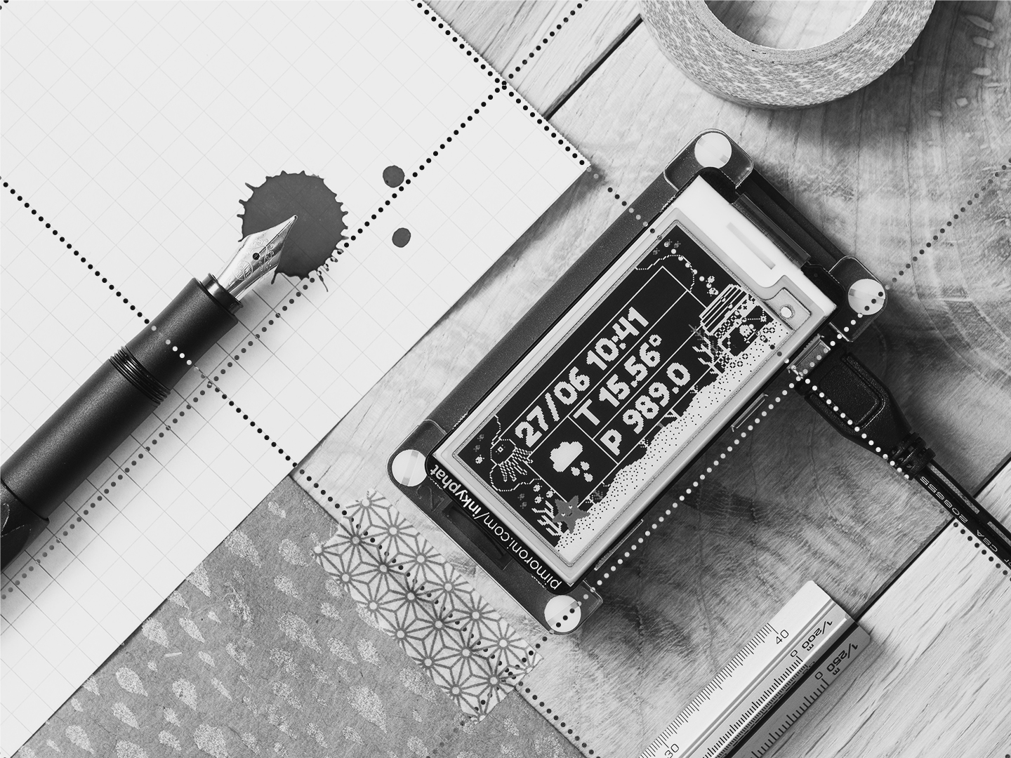
You’ll see that, with a diagonal image, you just rotate the grid so that it’s also diagonal. If you look at the image below, that’s not diagonal, you’ll see that I placed things so that the composition would work both ways.
Placing objects overlapping the edge of the image, like the roll of washi tape, paper, pen, and ruler, is another little thing that I like to do, to hint at how the image extends outside the composition that you see.
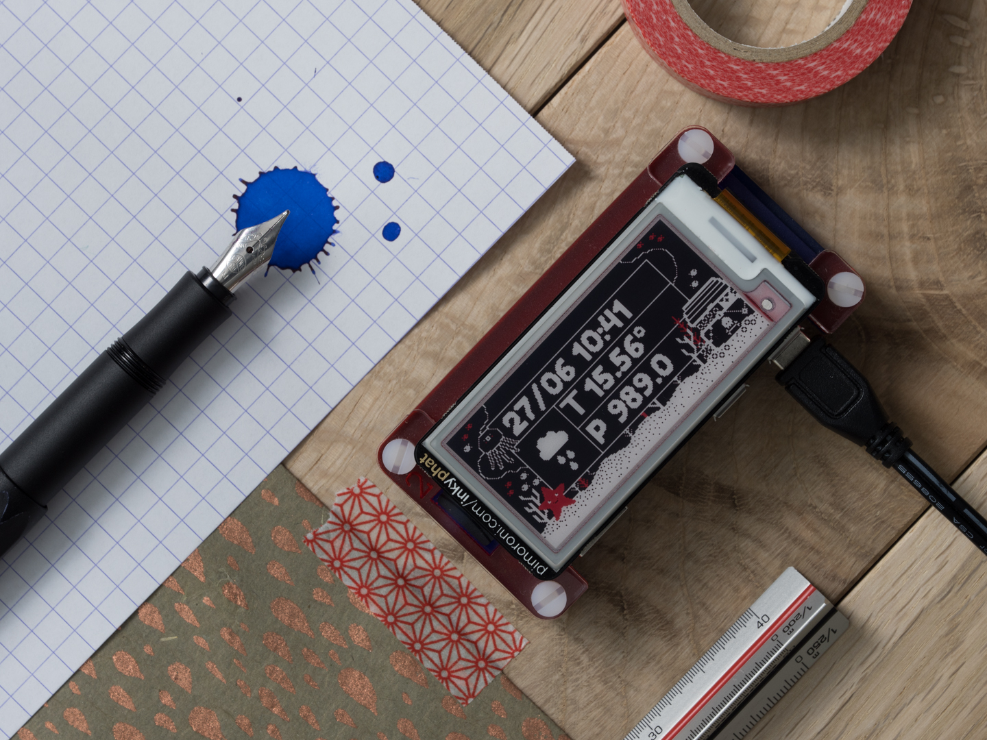
In terms of props, having a range of nice objects that you can use in photos is useful. As I said earlier, I love stationery, so you’ll often see items of stationery cropping up in my images. The objects I picked here were chosen to fit with the red, black, and white colour scheme of Inky pHAT - the red Pibow case, ink, washi tape, and ruler, the black pen and power supply lead, and the white grid paper (well, the ink was blue, but more on that later…)
The paper is some lovely handmade paper that I got from Paperchase, and is pretty much the only other thing, apart from the wood, that doesn’t fit with the red, black, white colour scheme. I felt that it gave a nice contrast and added some interest though.
Taking the shot
This was one of the first product shots that I took with my Panasonic GH5 camera, having got it just before I went to Berlin last summer. The lens was the Panasonic Leica 12-60mm f2.8-4.0, the one that I have on the camera most of the time. Compared with my previous Sony DSLR, the GH5 has much greater dynamic range and less noise, and I love the scope you have for pulling detail back from shadows with it.
For that reason, I tend to underexpose by between a half and a whole stop, as it’s much easier to pull out detail from underexposed areas than from overexposed. I almost always shoot in aperture mode, so that I can control the amount of depth of field in the image. For square-on images like this, I tend to shoot with more depth of field and keep everything in the image sharp; this shot was taken at f8.0 and ISO 100.
The camera was mounted above, facing down, on my 3 Legged Thing Rick tripod, and triggered with the Panasonic Image remote app. To prevent camera wobble with longer exposure times (because of the narrower aperture) like these, I always either use the 2 or 10 second timer or a remote trigger app. I almost always use this lens at 60mm as well, to avoid any barrelling of the image.
Here’s the shot as it came out of the camera.
Post-processing in Lightroom
You’ll see that the image straight out of the camera isn’t massively different to the final image. This is another top tip of mine - try to do as much to get the image looking right straight from the camera, rather than doing it all in post-processing; your image will end up looking much more natural.
In Lightroom, there’s a process I always follow to get the image looking as close to finished as possible:
- use the exposure slider to get the overall exposure to where I want
- increase or decrease highlights as necessary
- increase shadows to pull back some detail
- increase whites to make the image pop a little more
- decrease blacks to give a little more contrast
- increase clarity to about 10
- increase vibrance to about 10
Then, I’ll export the image to Photoshop to make more major changes and add some adjustment layers.
Re-touching and post-processing in Photoshop
If there aren’t any major changes to be made, and only small bits of dust and such to be removed, then I’ll just use the spot removal tool in Lightroom, but for any more major re-touching, I’ll use Photoshop.
Here, the biggest change to be made was changing the colour of the ink from blue to red. In hindsight, I should just have used red ink, but I didn’t have any with me at work that day.
I duplicated the whole image to a new layer, used the quick selection tool to select the ink spots then, using an adjustment layer with a selection mask covering the ink spots, I recoloured the spots to just the shade of red I wanted.
I used the clone brush tool to get rid of any obvious spots of dust from the black surround of the Inky pHAT and the red Perspex of the Pibow. It’s my tool of choice in Photoshop for small retouching jobs like that.
The final thing I do, and it’s something that I’ve only recently discovered, is to add a gradient overlay adjustment layer. These let you tone different areas of brightness in the image (highlights, midtones, shadows) different colours. They’re kind of equivalent to what Instagram filters do, although I use them very sparingly. I like the metal gradients, especially the gold and teal ones, and use the overlay blending mode at 10-20% opacity.
Final export from Lightroom
After saving the final Photoshopped image, I go back to Lightroom to export the final image/s. Lightroom is great for doing this, especially if you have a bunch of images to export. I tend to export to three different sizes - a full size, high DPI image; a 1080p, 72 DPI, landscape image; and a 1080p, 72 DPI, square image. I also add some sharpening at this final stage.
Here’s the final image again.
I hope that you found this blog interesting, and maybe picked up some useful tips. I’ll probably do some more of these with some other images, although I think I’ll do well to top this one, as it’s one of my favourites!!