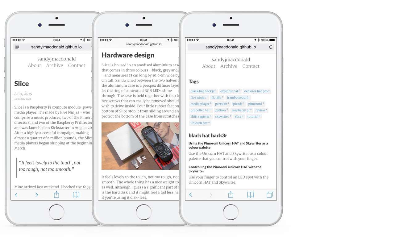
I decided to freshen things up a bit.

Late last year, I threw this blog together fairly quickly, with a combination of Jekyll, SASS and GitHub Pages, a lot of Googling, and not so much thought to the design. I wanted somewhere where I could write the odd blog post - be it a tutorial, or a review, or whatever - and I knew that I wanted to be able to write my posts in Markdown, for convenience.
I found the Lanyon Jekyll theme by Mark Otto and liked its clean look, with sans serif headings and serif body text. I tweaked a couple of things in the sidebar, added tags and fiddled with the styles a bit, but nothing major.
Over the past six months, a few things began to niggle me with regard to the design. The main thing was that I wasn’t keen on the typefaces, PT Serif and PT Sans. The PT Serif was a bit heavy for my liking, and the PT Sans too narrow and not heavy enough. Also, I wasn’t keen on the sidebar, as it didn’t really serve any good purpose.
There were quite a few features I wanted to add, and so I figured I may as well redo the whole darn thing. I wanted to have a simpler index, with short summaries of posts (easy to do with Jekyll) rather than the full post. I wanted to add read times to posts and to get the related posts working properly using tags shared between posts (not so easy without plugins). I also wanted to clean up the archive and tags pages, as looked really untidy, with different levels of indentation and bullet points all over the place.
Jekyll and GitHub Pages
If you want free hosting and painless blogging, while still maintaining some freedom over
the design of your blog, then I can’t think of a much better solution than
Jekyll and GitHub Pages. Jekyll is a
templating system that converts Markdown (and Liquid, HTML, CSS) to static HTML pages.
GitHub Pages is a service whereby you create your site with Jekyll and push it into a
GitHub repository and out of the other end comes a fully-formed website with your own
domain name (plus .github.io on the end).
You write your posts in Markdown and put them into a _posts folder, and that’s all there
is to it. As with any other site, you have stylesheets to change the looks, and you can
even write everything in HTML if you want (??!!) or mix and match HTML and Markdown as you
please.
There are a few really nice things about Jekyll, mostly from the Liquid template engine,
that make your life really easy. With Liquid, code in curly brackets in your HTML or
Markdown files allows you to use variables throughout your site. For instance, you can
grab the title of a blog post with {{ post.title }} or the tags
with {{ post.tags }}.
You can also do things that you’d do in a full-blown programming language like for loops
and if/else statements. Jekyll also lets you split different parts of your HTML up into
snippets that you can use in multiple places, again with the voodoo power of curly brackets,
e.g. {% include footer.html %}.
The Pixyll theme
There are lots of free, open-source themes available for Jekyll. That’s how I came across my original Lanyon theme, and how I found this new Pixyll theme from John Otander.
The Pixyll theme has a beautiful, clean look. Like Lanyon, it uses serif headings and sans serif body text; a look that I wanted to keep, despite wanting to change the typefaces. It uses Lato for the headings and Merriweather for the body text. I much prefer these typefaces; they look more modern.
It also fulfills the other changes I wanted: no sidebar, short summaries on the index page and read times for posts. It also has a nice contact page that uses Formspree for emails.
What’s new
Like I said, the whole thing looks cleaner now, I think. The tyopgraphy is much nicer. Those are the main changes. Importantly, the existing links, etc. should all still work as before.
I’ve made the tags at the ends of posts look nicer to fit in with the look of the tag index page. I’ve also got the related posts working correctly by matching tags between posts; previously it just showed the last five posts, whether they were related or not. The archive and tags pages look much tidier now that the indentation has been fixed and the bullet points have been removed.
It’s also fully-responsive, so it should look equally good on mobile, desktop or laptop.

I hope you like it as much as I do, but don’t be afraid to tell me if you don’t!