This is the last in my series of three posts about collecting, logging, and analysing home environmental data with the Raspberry Pi and the Pimoroni Enviro board:
- Setting up InfluxDB and Grafana on the Raspberry Pi 4
- Logging Raspberry Pi environmental data to InfluxDB
- Analysing home environmental data with InfluxDB and R
Background
In the past two posts, we’ve seen how to set up a Raspberry Pi 4 with InfluxDB and Grafana, and how to use a Raspberry Pi Zero W with Pimoroni Enviro board to measure and send environmental data to the InfluxDB database and then view it on a Grafana dashboard. But now you’re collecting all that data, what can you do with it?
In my day job, I’m a bioinformatician, someone who analyses biological data, using a lot of Python and R. R is a programming language for data analysis and statistics, and it’s especially good for working with tabular data and plotting it. Like Python, there’s an abundance of libraries available to do all sorts of things in R, like… reading data from InfluxDB databases straight into data frames, the tabular data format that’s central to R.
This post will mostly be looking at the results of the analysis I’ve done, but I’ll give a full worked example of how to calculate the mean temperature and humidity trend through the day. It covers most of the steps you’ll need to know to do your own analysis.
Installing RStudio
RStudio is an IDE (Integrated Development Environment) for R, and it’s the way that I write and run code in R day to day. It has a code editing window where you can write and edit code, a console where you can see the output from your code, a viewer where you can view plots and other graphical output, and an environment viewer where you can see all the variables (including data frames) that you’ve created.
Before installing RStudio, you’ll need to install R, which isn’t bundled with RStudio. You can download it here: https://www.stats.bris.ac.uk/R/
Once you’ve downloaded and installed R, go ahead and download and install RStudio here: https://www.rstudio.com/products/rstudio/download/
Installing the required R packages
Open RStudio and, in the console at the bottom, type the following:
install.packages(c("tidyverse", "zoo", "xts", "influxdbr", "wesanderson"))
This will install the libraries we need to query the InfluxDB database, analyse the data, and then plot it. The tidyverse library is a collection of a bunch of great libraries, including dplyr for manipulating tabular data and ggplot for making amazing looking plots. xts and zoo are libraries for working with time series data, influxdbr is the library for connecting with InfluxDB databases, and wesanderson (yes, that’s right) is a collection of Wes Anderson inspired colour palettes.
Plotting daily temperature and humidity trends
Let’s look now at how we can do some analysis of temperature and humidity data that have been collected with the Pimoroni Enviro board over a period of almost two years.
If you don’t already have a new R script open in RStudio, then open one by going into the “File” menu, then “New File”, then “R Script”.
We’ll build our script bit by bit, and I’ll explain what each chunk of code is doing as we go through it.
First, we’ll import the libraries we need and set our working directory:
library(tidyverse)
library(lubridate)
library(zoo)
library(xts)
library(influxdbr)
library(wesanderson)

setwd("/path/to/your/folder")
Next, let’s create a connection to our InfluxDB database. You’ll need to change the IP address to match the IP address of the Raspberry Pi running your InfluxDB and Grafana server. You’ll also need to change the username and password to whatever you set when you were first setting up your InfluxDB database.
Also make sure that the db and measurement names match what you set. The
names below are the examples I gave in the last tutorial, so if you followed
that then they should work without needing to be changed.
The second function call, influx_select() is the one that actually queries
our database and stores the result. You’ll see that we’ve asked it to return
two fields temperature and humidity. If we wanted more fields, we could
simply add them after another comma. If we wanted all of the fields, we could
say field_keys="*.
con = influx_connection(host="192.168.0.100",
                         port="8086",
                         user="grafana",
                         pass="grafana")

result = influx_select(con=con,
                        db="home",
                        field_keys="temperature, humidity",
                        measurement="indoor",
                        group_by="*",
                        limit=NULL,
                        order_desc=FALSE,
                        return_xts=FALSE)
Next, we’ll store the result in a df variable and do some cleaning up of the
time stamps that InfluxDB returned with dplyr’s mutate() function. The
ymd_hms() function turns the time stamp string into a proper datetime that we
can use for grouping and summarising the data later. We’re also creating new
columns in our dataframe with the hour, minute, minute in the day, and day in
the year.
The special %>% notation used here allows you to pass the results of one
function on to the next, without having to assign it back to the original df
variable each time.
df = result[[1]]

df = df %>%
  mutate(time = ymd_hms(time, tz="GMT")) %>%
  mutate(hour = hour(time)) %>%
  mutate(minute = minute(time)) %>%
  mutate(minuteinday = (hour * 60) + minute) %>%
  mutate(dayinyear = yday(time))
This next chunk of code uses some the dplyr library’s powerful manipulation
functions to group and summarise our data. Because we want to look at the trend
of temperature and humidity through the day, we’ll group the data using the
minuteinday column that we added.
Most times you use group_by(), you’ll follow it up directly with summarise()
to get the sum, the minimum or maximum, mean, or so on, of your grouped data.
Here, we’re getting the mean of the temperature and humidity for each minute.
We’re then using filter() to filter out some outliers in the data. Your data
may not have any, or they may be different, so change these lines as necessary.
Because we’re plotting the humidity data on a second y-axis and ggplot doesn’t
support having two y-axes with different scales, we use mutate() to divide all
of the humidity values by 5. Since our temperature values are in the 10-20 range,
and our humidity values are in the 50-100 range, this should bring the humidity
values down to approximately the same range.
We’ll also create an hour column that we’ll use for our x-axis scale, since
hours of the day are a little easier to suss out than minute of the day!
Last of all, we need to pivot the data frame so that all of the variables and
values are together in single columns rather than separate ones, using the
pivot_longer() function from dplyr.
summary = df %>%
  group_by(minuteinday) %>%
  summarise(temperature=mean(temperature),
            humidity=mean(humidity)) %>%
  filter(temperature > 11) %>%
  filter(humidity > 45) %>%
  mutate(humidity = humidity / 5) %>%
  mutate(hour = minuteinday / 60) %>%
  pivot_longer(cols = c("temperature", "humidity"),
               names_to = "var",
               values_to = "val")
Finally, we’ve made it to the point where we can plot our data, using ggplot. I won’t go into all of the details of what’s happening here, as ggplot is a dark art that combines luck, perserverance, and your ability to search Stack Overflow threads for the correct way to do things, but I’ll cover the main points.
We’re using geom_smooth() which fits a line to our data. There are various
options for which method to use for fitting the curve but, in this case, the
default works well. The span determines how smooth or jagged the fitted line
becomes. We’re plotting time (hour) on the x-axis, the values (val) on the
y-axis, and colouring the line (and the points later) by which variable (var)
it is, i.e. temperature or humidity.
geom_point() does exactly what you’d expect - draws points for all of our
individual data points. Again, we’re colouring by the variable, and we’re using
50% opacity for the points (alpha=0.5) to allow the points to overlap and
still be seen through each other.
We’re using one of the Wes Anderson colour palettes, and applying it with
scale_colour_manual() with two colours for our two variables (n=2)
To add the second y-axis, we’re using scale_y_continuous() and configuring
the sec.axis argument. The ~.*5 tells ggplot that it needs to multiply the
second y-axis scale back up by 5x, so that the numbers on the axis look correct.
The remainder is just cosmetic stuff, labelling axes, setting font sizes, etc.
To save the figure, you can use the ggsave() function and pass it our plot
object g.
g <- ggplot() +
  geom_smooth(data=summary, aes(x=hour, y=val, color=var), span=0.15, level=0.99) +
  geom_point(data=summary, aes(x=hour, y=val, color=var), alpha=0.5) +
  scale_colour_manual(values = wes_palette("Moonrise3", n=2)) +
  scale_x_continuous(breaks=seq(0, 24, 3), minor_breaks=NULL) +
  scale_y_continuous(sec.axis=sec_axis(~.*5, name="Mean relative humidity (%)")) +
  theme_minimal(base_size=14) +
  theme(plot.title=element_text(size=14, hjust=0.5), legend.position="bottom",
        legend.title=element_blank(), axis.title.x=element_text(vjust=-0.5),
        axis.title.y=element_text(vjust=0.5)) +
  guides(color=guide_legend(override.aes=list(fill=NA), nrow=1, rev=TRUE)) +
  xlab("Hour in day") + ylab("Mean temperature (°C)") +
  ggtitle("Temperature and humidity, daily mean")

g

ggsave("daily-temperature-and-humidity.jpg", dpi=600, width=9, height=7, plot=g)
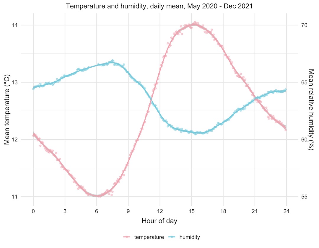
Let’s have a look at the plot we made. It’s remarkable how good the data look; two beautiful curves that are the exact inverse of each other. Temperature starts rising in the morning, peaks in mid afternoon, then starts falling again through the evening and night. Humidity does the opposite, dropping through the daylight hours and then rising through the night. This fits with what we know about the relationship between temperature and relative humidity.
You might wonder why both of the curves span only a small range of temperature and humidity. Well, both of these are the average values from almost two years’ worth of data, so they represent the average through all of the seasons of the year, hot and cold. The data are from the Enviro+ just outside our front door, so they’re outside temperature and humidity readings. We can infer that the mean temperature (of all of the values) is around 12.75°C looking at the temperature curve, and that the mean relative humidity is around 63 or 64%.
Temperature data
Let’s look at the outdoor temperature data in a couple of different ways.
Violin plots are better alternative to box plots, as they give you much more information about the distribution of all of the data points within each set of grouped points, rather than just the quartiles. The violin plot below shows the maximum daily temperatures, grouped by month, throughout the period that I’ve been collecting data.
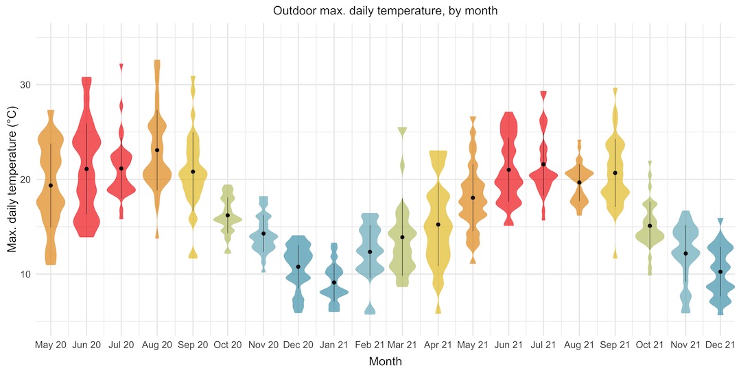
This is great. It lets us see, at a glance, that the monthly temperatures follow a nice sine curve through the year. It gives us much more information than that though! We can see that May and June 2020, and April 2021 had really wide ranges of maximum daily temperatures, whereas other months like October and November 2020 had much tighter ranges, over fewer than 10 degrees. It looks like summer 2020 was probably slightly warmer than summer 2021.
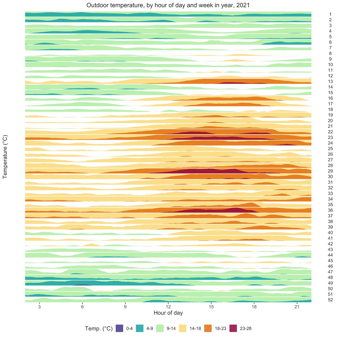
What if we wanted to look in detail at the daily temperature trends across the whole year, to try to identify spells of particularly warm or cold weather? A horizon plot is an ideal way to look at this. It’s a series of area plots, stacked vertically, with a “hotness” colour palette to show the ranges of temperatures, blue being the coldest, through green and yellow, to red. Each plot from top to bottom is a week in the year, and the x-axis shows time of day. The horizon plot shows us that there were a couple of nice spells of weather in late March and late April, and hot spells in early June, late July, and early September.
Light level data
As well as temperature, pressure, and humidity, the Enviro+ also senses ambient light level. Let’s have a look at some of the light level data that I’ve collected.
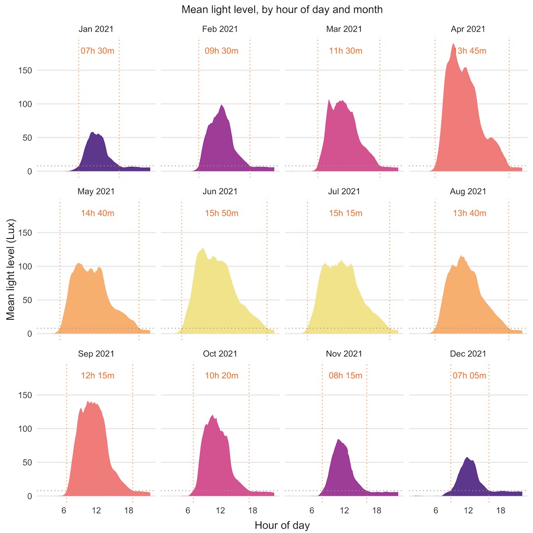
We’ll look first at another horizon plot that shows mean light level through the day, by month of the year. I’ve added a couple of nice touches to these plots, with dotted lines showing the point at which the light level crosses a threshold equivalent to sunrise or sunset and calculated the hours of daylight from there. This plot isn’t quantitative, but it does show nicely the seasonal trend of light level through the year. The white areas on each plot are a feature of the way the horizon plot is displayed, with a point of inflection at the midpoint of values.

As I said, the horizon plot isn’t quantitative, although it does show the daily, monthly, and yearly trend nicely and lets you compare across the whole year’s data. The series of separate monthly plots below are quantitative, letting you see the overall trends, and additional features, like months with higher than expected mean light levels, like April 2021. I’ve shown the same sunrise/sunset thresholds and hours of daylight.
Particulate matter data
The particulate matter (PM) sensor attached to the Enviro+ measures particulates in the air and distinguishes their size to some extent, with readings for fine particulates (PM2.5) and also larger ones (PM10). Because of the way the sensor works, the PM10 reading will also include the fine particulates, so the PM10 reading is always somewhat higher than the PM2.5 reading.
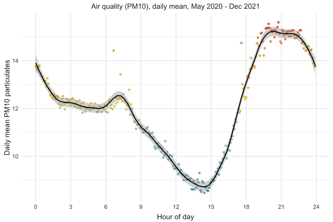
I thought it would be interesting to look at the daily trend of PM10, to see if there was any pattern to the air quality through the day. To look at this, I’m plotting the mean PM10 level by hour of day. If there was no trend, I guess we’d expect to see the points scattered almost randomly. Instead, what we see is that the PM10 level starts rising at around 3pm, peaking between 8pm and 11pm, then falls through the night and morning, with a bump between 7 and 8am.
Particulate matter levels are affected in a complex way by other environmental factors like humidity, rainfall, temperature, wind speed and direction, as well as human factors like vehicle emissions, wood burners, etc. At first glance, it doesn’t look like the PM10 trend follows either temperature or humidity directly, although it could be that it follows either of those with a lag of several hours.
I do wonder whether the bump in the morning is the morning rush hour traffic going past our house, which is on a road that gets fairly busy between 7 and 9am.
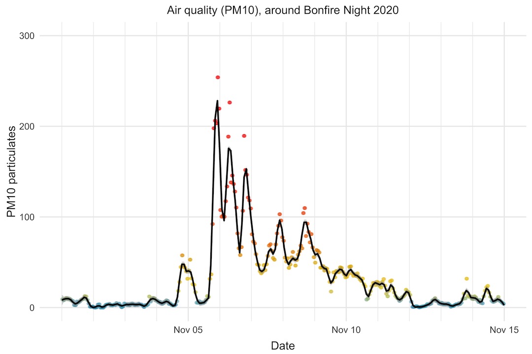
Bonfire Night
One clear trend in the PM10 data is what happens around Bonfire Night, on the 5th of November. Bonfire Night is a uniquely British thing, which I don’t really understand, but is something along the lines of us blowing things up and setting fire to things to celebrate someone not managing to blow Parliament up.
What is clear is that it has a terrible effect on air quality. If we look at the PM10 levels in the two weeks around Bonfire Night 2020, we can see that it shot up to more than 200 (15 is the WHO annual mean limit, and 45 the daily mean limit), taking around a week to settle back to normal levels.
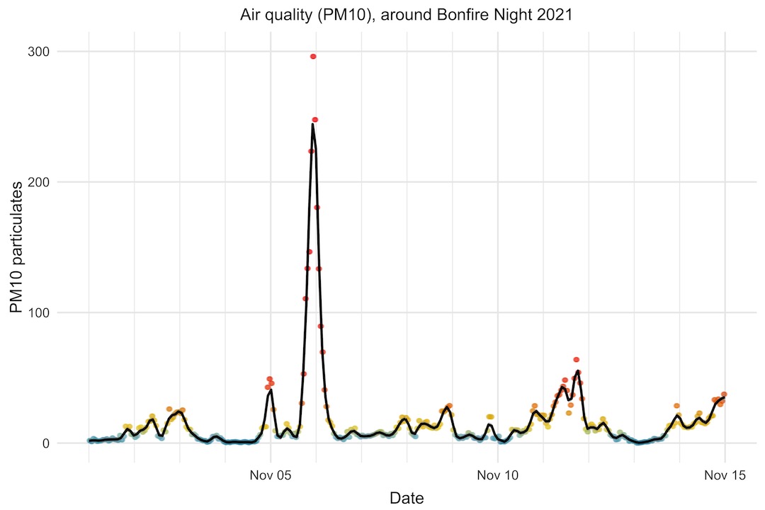
Interestingly, this year (2021), the PM10 level shot up to a similar level as in 2020, but dropped much more quickly afterwards. Perhaps weather conditions were more favourable this year to clear the air more quickly.
Another intersting thing is the smaller bump the day before Bonfire Night. It seems like some people have itchy trigger fingers and start a day early!
Correlating environmental factors
As well as the Enviro+ at the front of our house, I’ve recently set up a weather station (also Raspberry Pi Zero W powered, with a soon-to-be-released Pimoroni Weather HAT) at the back of our house. It measures temperature, humidity, pressure, light, wind speed and direction, and rainfall.
I thought it would be interesting to look at whether there were any correlations between these factors, beyond the most obvious ones like the inverse temperature and humidity relationship. I’ve included the PM2.5 and PM10 also.
The colours and numbers on the plot are as follows: red is a perfect positive correlation or 1.0, white is no correlation or 0.0, and blue is a perfect negative correlation or -1.0, with shades of red and blue between those limits.
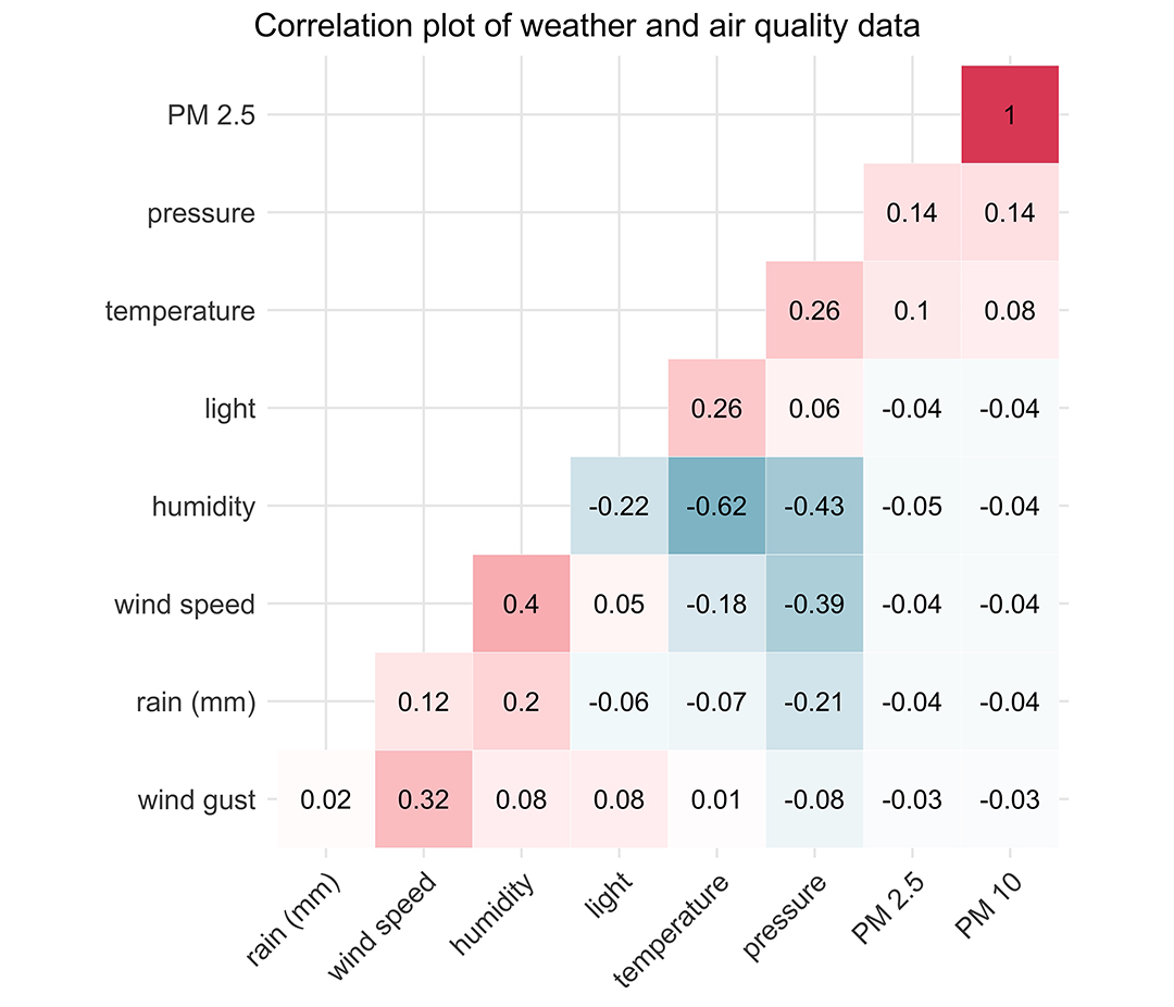
We can see that PM2.5 and PM10 are perfectly correlated with each other, as we’d expect. There does appear to be somewhat of a positive correlation between particulates and temperature.
Pressure and temperature are positively correlated with each other, which fits with what we know about higher pressure coinciding with spells of warmer weather, at least in the summer. Pressure is negatively correlated with rainfall, humidity, and wind speed, which fits with lower pressure leading to more unsettled weather.
Humidity and rainfall are positively correlated with each other, as expected, but humidity and rainfall are also both positively correlated with wind speed, fitting with what we know about wind speed rising as a weather front approaches with rain.
There is somewhat of a positive correlation between light level and temperature, and a negative correlation between light level and humidity. Temperature tends to lag light level by a few hours, so this is probably the reason for the correlation coefficients not being stronger here. I expect if we shifted the light data forward by about 6 or 8 hours, we’d see a much stronger correlation with both temperature and humidity.
That’s all for now. I hope you found this series of posts useful.